Open a crypto chart for the first time and it looks like a heart-rate monitor in a bar fight. Red things, green things, lines, dots, a scrolling number that keeps changing. Most people close it. The ones who don’t close it usually misread it, take a trade based on something they saw a YouTuber draw, and lose money. Reading a chart properly is the most useful skill in crypto trading — and it’s also the most badly taught. Here’s the version I wish someone had walked me through six years ago.
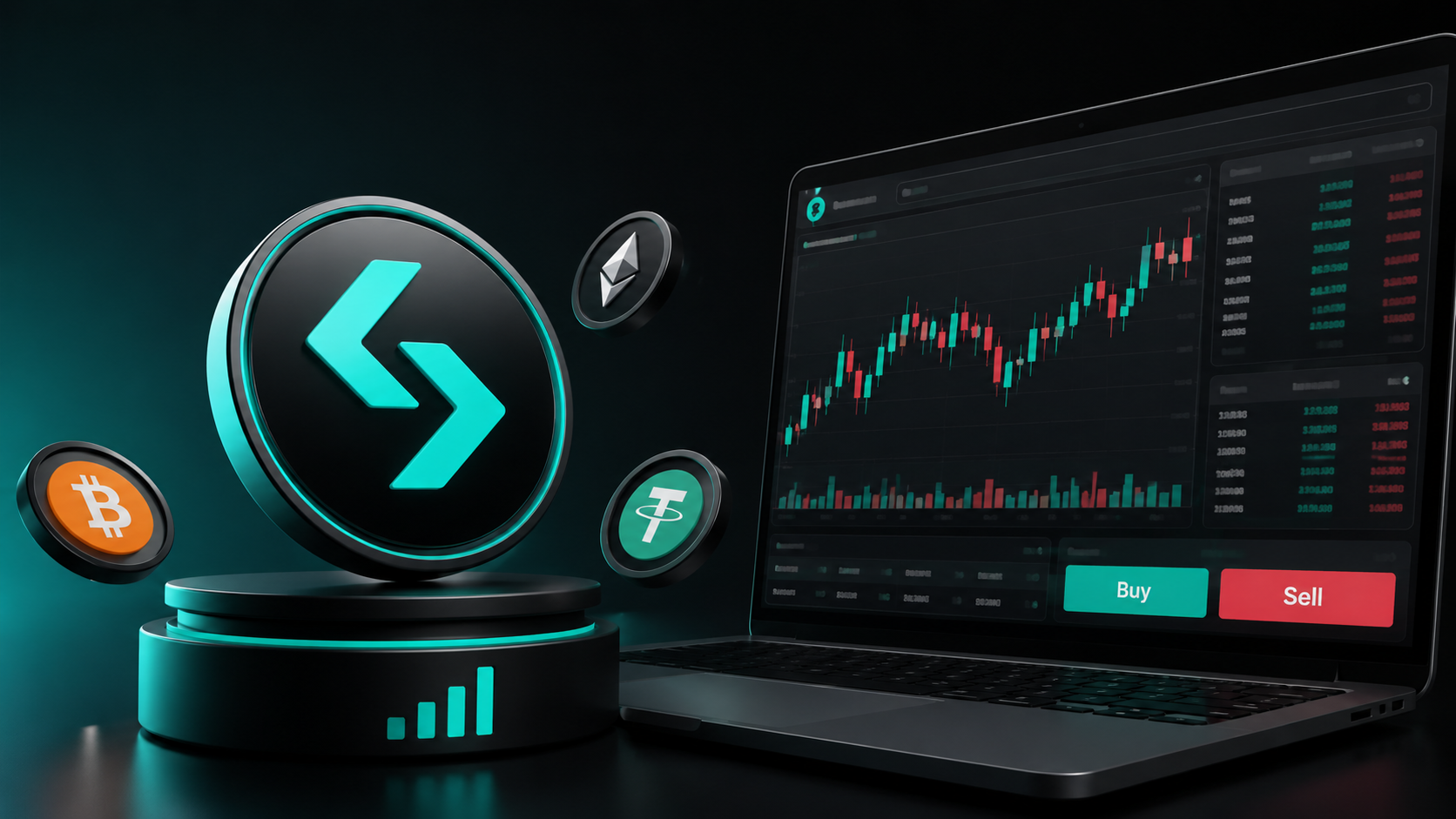
Short answer: To read a crypto chart, start with the candlesticks (each candle shows open, high, low, and close for a fixed time period), then identify the timeframe you’re working on, then mark major support and resistance levels. From there, look for chart patterns and trend structure. The single biggest mistake beginners make is using only one timeframe — confirming a setup across at least two timeframes filters out most bad trades. I do all my chart work on TradingView and execute on BitGet.
See Trade Travel Chill → (affiliate link) · Open BitGet → (referral)
Key takeaways
- A candlestick shows open, high, low, and close for a time period — body and wicks both matter.
- Multiple timeframes confirm or invalidate setups. Single-timeframe trading is how most beginners lose.
- Support, resistance, and trendlines are the foundation. Patterns sit on top of structure.
- Volume is the missing dimension. A pattern without volume confirmation is unreliable.
- Chart reading is a skill that takes hundreds of reps to develop. Communities like Trade Travel Chill drill it in faster than reading alone.
Table of contents
- Why chart reading matters (and where it fails)
- Candlestick anatomy (body, wick, colour)
- The 8 candle patterns that actually matter
- Timeframes and how multiple confirm a setup
- Support and resistance
- Trendlines
- The 3 most important chart patterns
- Volume — the missing dimension
- How to set up TradingView for crypto
- Common chart-reading mistakes
- How I actually learnt to read charts
- FAQ
Why chart reading matters (and where it fails)
Chart reading is the foundation of every active trading strategy. Whether you swing trade, day trade, or scalp, you’re making decisions based on what the chart is telling you about price, volume, and momentum.
But chart reading has a credibility problem. Half the internet is convinced that technical analysis is voodoo — that lines drawn on past prices have no predictive value. The other half draws fifteen indicators on a chart and convinces themselves they’ve found a secret.
The truth sits in the middle. Charts don’t predict the future. What they do is show you where other traders are likely to react. When a price has bounced off the same level four times, that level matters — not because of some mystical property, but because every trader watching the chart sees the same level and is going to react around it.
Where chart reading fails:
- Treating it as predictive. It’s probabilistic. A “bullish setup” might be 60% likely to play out. 40% of the time it doesn’t.
- Using too many indicators. Three is plenty. Eight is noise.
- Trading every single signal. Most signals don’t matter. The work is filtering.
- Skipping the higher timeframe. A “buy” on the 5-minute means nothing if the daily is in a downtrend.
Get the structural reading right and the rest is filtering.
Candlestick anatomy (body, wick, colour)
Every crypto chart you’ll use is built from candlesticks. Each candle represents a fixed time period — 1 minute, 5 minutes, 1 hour, 1 day, whatever timeframe you’ve selected.
Each candle has four data points:
- Open — the price at the start of the period
- High — the highest price during the period
- Low — the lowest price during the period
- Close — the price at the end of the period
The candle’s shape encodes all four:
The body
The thick rectangular part of the candle. It spans from the open to the close.
- Green (or white) body = close was higher than open. Price went up during this period.
- Red (or black) body = close was lower than open. Price went down during this period.
The wicks
The thin lines extending above and below the body.
- Upper wick — from the top of the body to the high of the period.
- Lower wick — from the bottom of the body to the low of the period.
A long upper wick means price went high during the period but came back down. A long lower wick means price went low but recovered.
Reading a single candle
Combine body and wicks and you can read what happened during that period at a glance:
- Big green body, small wicks → strong, decisive buying through the whole period
- Big red body, small wicks → strong, decisive selling through the whole period
- Small body, long upper wick → price tried to push up, got rejected, came back down
- Small body, long lower wick → price tried to push down, got rejected, came back up
- Tiny body, long wicks both sides → indecision, fight between buyers and sellers
That’s the alphabet. Now we look at words.
For the canonical reference on candlestick definitions, Investopedia’s candlestick primer is a solid starting point.
The 8 candle patterns that actually matter
There are dozens of named candle patterns. Most are noise. These are the eight that show up repeatedly and that I actually pay attention to.
1. Doji
A candle where the open and close are essentially the same (tiny body, wicks both sides). Signals indecision. At a key support or resistance level, a doji often precedes a reversal.
2. Hammer
A candle with a small body at the top and a long lower wick (at least twice the body). At the bottom of a downtrend, a hammer suggests buyers stepped in and rejected lower prices. Bullish reversal signal.
3. Inverted hammer / shooting star
Small body at the bottom, long upper wick. At the top of an uptrend, suggests sellers stepped in. Bearish reversal signal.
4. Bullish engulfing
A green candle whose body completely engulfs the previous red candle’s body. Strong bullish reversal — buyers took over decisively.
5. Bearish engulfing
A red candle that completely engulfs the previous green candle. Strong bearish reversal.
6. Morning star
A three-candle pattern at the bottom of a downtrend: big red candle, small-body candle (doji or hammer), big green candle. Strong bullish reversal.
7. Evening star
The mirror of morning star at the top: big green, small body, big red. Strong bearish reversal.
8. Long-bodied trend candle
Not a “pattern” in the traditional sense, but pay attention to single candles with very large bodies and small wicks. They show conviction. When one appears at a key level, it matters.
What I actually do with these
I don’t trade off a single candle pattern. I use them as confirmation of something else. A hammer at random is meaningless. A hammer right at a major support level on a higher timeframe is a signal worth a trade.
The pattern + level + volume combination is where the edge lives. The pattern alone is just shapes.
Timeframes and how multiple confirm a setup
This is the section that fixes more new traders’ P&L than any other.
A “timeframe” is the period each candle represents on your chart. Common crypto timeframes:
- 1-minute (1m) — for scalping
- 5-minute (5m) — for day trading entries
- 15-minute (15m) — for day trading
- 1-hour (1H) — for short-term swing setups
- 4-hour (4H) — for swing trading
- Daily (1D) — for major swing and position trades
- Weekly (1W) — for long-term trend context
Why multi-timeframe matters
A bullish signal on the 5-minute can be a tiny counter-trend bounce inside a massive downtrend on the daily. If you only look at the 5-minute, you’d take a long. If you look at both, you’d see the daily downtrend and either skip the trade or take a short instead.
Rule of thumb: always check at least two timeframes — one higher than your trade timeframe, one lower for entry.
The classic 3-timeframe stack
- Higher timeframe (HTF) — sets the trend. If daily is trending up, you’re looking for longs.
- Trade timeframe — where you find your setup. If you’re swing trading, this might be the 4-hour.
- Lower timeframe (LTF) — refines your entry. Look at the 1-hour for the cleanest entry trigger.
This approach forces you to align with the dominant trend instead of fighting it.
The mistake to avoid
Don’t try to confirm a 5-minute setup on the daily — the daily moves too slowly to align with a 5-minute signal. Stay within a factor of 4–6x between your timeframes. Daily for HTF, 4-hour for trade, 1-hour for entry. Or 4-hour for HTF, 1-hour for trade, 15-minute for entry. Don’t mix daily and 5-minute directly.
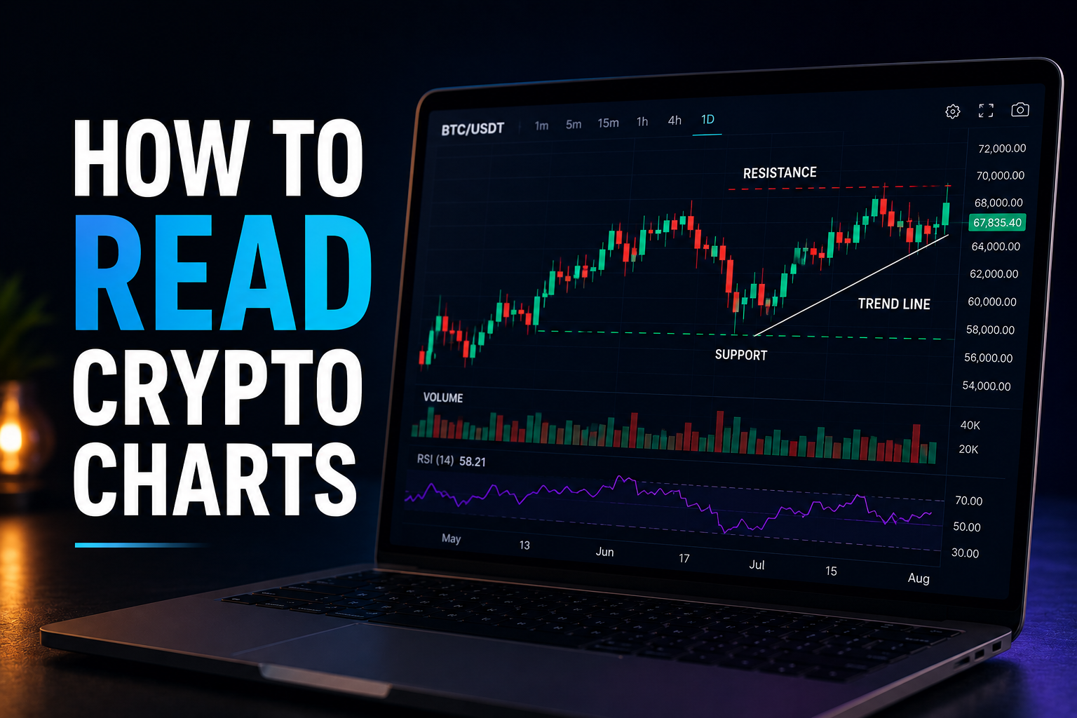
Support and resistance
The most important concept in chart reading.
Support = a price level where buying interest has historically stepped in and prevented further declines.
Resistance = a price level where selling interest has historically stepped in and prevented further rises.
These aren’t magic levels. They’re prices where enough traders are watching that orders cluster.
How to identify support and resistance
- Look for prior bounces. If price has reversed from $60,000 multiple times, $60,000 is support (if approached from above) or resistance (if approached from below).
- Look for big-volume rejections. Where price spiked into a level and got slammed back, that level matters.
- Look at round numbers. $50,000, $100,000 — psychological levels that get more attention than nearby specific numbers.
- Watch where wicks consistently end. Multiple long wicks ending at the same price suggests strong rejection.
Drawing levels properly
I draw levels as zones, not lines. Price rarely respects a specific number — it respects an area. $60,000–$60,500 is a more useful zone than “60,000 exactly.”
I usually mark 3–5 major levels per chart. More than that and the chart looks like spaghetti and you’ve removed any value the levels were providing.
Why levels work
Levels work because they’re self-fulfilling. Enough traders see the same level, place orders around it, and the level holds because of those orders. When a level breaks decisively, it often flips role — old resistance becomes new support, and vice versa.
Trendlines
A trendline is a diagonal line drawn along multiple swing highs or swing lows to define the direction and slope of a trend.
How to draw them
- Uptrend line — drawn along at least two swing lows (more is better). Slopes up.
- Downtrend line — drawn along at least two swing highs. Slopes down.
The trendline acts as dynamic support (in an uptrend) or resistance (in a downtrend). As price approaches the line, you watch for reactions.
What trendlines tell you
- Trend intact — price keeps respecting the line as support/resistance.
- Trend weakening — price tests the line more frequently or breaks it briefly.
- Trend broken — price closes decisively through the line, especially on volume.
Combine with structure
A trendline alone is weak signal. A trendline + a horizontal support level intersecting at the same place + a candlestick rejection from that intersection = a high-probability setup.
This is the principle: confluence makes signals. Single signals are noise. Multiple confirming signals at the same point are where the edge is.
Want chart reading drilled in properly?
Reading charts is a skill with hundreds of reps. Trade Travel Chill is the community I learned in — real working traders walking through real charts in real time. Faster than learning alone.
Affiliate link.
The 3 most important chart patterns
You can find lists of 50+ named chart patterns online. Most don’t matter. These three do.
1. Head and shoulders (and inverse)
The most reliable reversal pattern.
- Head and shoulders — three peaks: a higher peak (head) flanked by two lower peaks (shoulders). Forms at the top of an uptrend. When the “neckline” (the support connecting the lows between the peaks) breaks, it signals a reversal to downtrend.
- Inverse head and shoulders — the same pattern flipped. Forms at the bottom of a downtrend, signals reversal to uptrend.
The pattern works because it shows distribution (sellers taking over) at a top, or accumulation (buyers stepping in) at a bottom.
2. Triangles
Consolidation patterns that often precede breakouts.
- Ascending triangle — flat top resistance + rising lows. Suggests buyers gaining strength. Usually breaks up.
- Descending triangle — flat bottom support + falling highs. Suggests sellers gaining strength. Usually breaks down.
- Symmetrical triangle — both highs and lows converging. Direction is uncertain — you trade the break, not the prediction.
Triangles signal that volatility is compressing. When they break, the move is often sharp.
3. Flags and pennants
Continuation patterns. After a strong move, price consolidates briefly in a tight range or small triangle before continuing in the original direction.
A flag in an uptrend is a buying opportunity. A flag in a downtrend is a shorting opportunity. The key is that flags appear during strong trends, so you’re trading with momentum.
How to trade patterns properly
- Wait for confirmation. Don’t enter inside the pattern — enter on the break, ideally with a confirming candle close beyond the pattern boundary.
- Use volume. Patterns breaking on rising volume are more reliable than breaks on flat volume.
- Set stops at the invalidation point. For a triangle break, stop goes back inside the triangle. For head and shoulders, stop above the head.
- Target the pattern height. The classic measured move is to project the height of the pattern from the breakout point — that’s your minimum target.
For more on pattern trading, TradingView’s pattern education hub has visual references for every major pattern.
Volume — the missing dimension
Most new traders ignore volume. It’s the single biggest missed signal in chart reading.
What volume tells you
Volume is the number of units traded in a given period. A green candle on high volume = strong buying. A green candle on low volume = weak buying that probably won’t continue.
The principle: price movement should be backed by volume. When it isn’t, the move is suspect.
How I use volume
- Breakouts: A breakout above resistance with high volume is real. A breakout on low volume often reverses (false breakout / “fakeout”).
- Reversals: A reversal candle (hammer, engulfing) at a key level is much stronger if accompanied by a volume spike.
- Trends: Uptrends should have higher volume on up candles than down candles. When that flips, the trend is weakening.
- Consolidations: Volume typically contracts during sideways consolidations. A volume expansion often signals the breakout direction.
The two volume indicators worth using
- Volume bars — the default histogram at the bottom of every chart. Always on.
- Volume Profile — shows volume traded at each price level (rather than at each time). The high-volume levels are often support/resistance.
I cover Volume Profile and VWAP in detail in crypto trading indicators.
How to set up TradingView for crypto
TradingView is the standard charting tool for crypto traders. Free tier covers most beginner needs.
The basics
- Sign up at tradingview.com — free account is fine to start.
- Search for the asset. Type “BTCUSDT” and pick the exchange you trade on. I use BTCUSDT on BITGET because my trading executes there.
- Set up your chart layout. Candlesticks (not line, not bar). Dark or light theme — personal preference.
- Set your timeframes. Save your most-used timeframes (5m, 1H, 4H, 1D) in the timeframe bar so you can flick between them quickly.
Indicators to add
Don’t go overboard. My default chart:
- 20 EMA — short-term trend
- 50 EMA — medium-term trend
- 200 EMA — long-term trend
- Volume — always on
- RSI (optional) — momentum
That’s it. Five things on the chart. Anything more starts to add noise instead of signal.
BitGet integration
If you trade on BitGet, the BitGet TradingView integration lets you place trades directly from the TradingView chart. Connect your BitGet account, set up the broker, and you can buy/sell without switching tabs.
This sounds like a minor convenience. It’s actually a meaningful workflow improvement once you start trading actively.
Saving setups
- Templates — save your indicator setups so every chart you open has the same layout.
- Watchlists — group your tracked coins. Mine is BTC, ETH, SOL, BNB, plus whatever’s running.
- Alerts — set price alerts on key levels so you don’t have to stare at charts.
The full TradingView education hub covers the platform’s features in depth.
Common chart-reading mistakes
After watching new traders for years (and being one myself), these are the mistakes I see most often.
1. Single timeframe trading
Looking only at the 5-minute and ignoring the daily. You’ll take counter-trend trades all day. Fix: always check the higher timeframe first.
2. Too many indicators
Eight indicators, ten oscillators, three moving average crossovers. Your signals will conflict and you’ll have a reason to do nothing — or to do everything. Fix: pick 3 indicators max. I cover the picks in crypto trading indicators.
3. Drawing levels everywhere
If your chart has 15 horizontal lines on it, you’ve created confirmation bias for every direction. Fix: 3–5 major levels per chart. Refresh them as price moves.
4. Trading the chart in isolation
Ignoring news, macro context, or what Bitcoin is doing while you trade altcoins. Altcoins follow Bitcoin most of the time. If BTC is dumping, your altcoin long is probably wrong regardless of what its own chart says.
5. Confirming what you already believe
You think Bitcoin’s going up, so every signal looks bullish. Fix: pretend you have no position and ask whether you’d open a fresh trade in the direction you’re considering.
6. Ignoring volume
The most common chart-reading omission. Add the volume bars to every chart. Read them.
7. Trading patterns blindly
Seeing a triangle and immediately taking a position. Patterns are probabilistic. Wait for confirmation (break + close + volume) before entering.
8. Treating TA as gospel
Technical analysis is a tool, not a religion. When the chart says one thing and the news cycle says another, weight both. The chart isn’t always right.
How I actually learnt to read charts
Honestly? Three things.
1. Reps
Hours and hours of looking at charts. Marking levels. Drawing patterns. Predicting moves and being wrong, and then figuring out why I was wrong. There’s no substitute for screen time.
If you spend 30 minutes a day looking at the BTC daily chart for 6 months, you’ll have read 180 hours of crypto price action. That’s enough to develop pattern recognition.
2. A journal
Every trade I take gets a chart screenshot before entry, marked up with my reasoning. After the trade closes, I revisit the screenshot and ask: what did I see correctly? What did I miss? What signal did I ignore?
Over 100+ trades, patterns emerge in your own mistakes. You’ll find you consistently misread certain setups. That’s the signal to focus practice there.
3. A community
Reading alone is slow. Reading alongside experienced traders is fast. Hearing someone with five years more experience say “I’d skip that setup because the volume isn’t there” teaches you faster than reading a book that says the same thing.
I joined Trade Travel Chill (affiliate) in 2023 specifically because reading alone wasn’t getting me anywhere. The community calls are essentially live chart walkthroughs. The member chat is where I’d post a setup, get instant feedback, and discover the thing I missed.
It’s a paid community — full details in my TTC review — and it’s the single thing that accelerated my chart reading the most.
If TTC isn’t your thing, the wider list of options is in best crypto trading courses. Whatever you pick, the structure is: reps + journal + community. Skip any of those three and progress is slow.
Reading charts properly is a skill — and a learned one.
TTC is the community where I learned to read charts without fooling myself. Live walkthroughs, structured modules, member chat full of working traders.
Affiliate link.
Frequently asked questions
How do you read crypto candlestick charts for beginners?
Start with the candle anatomy — body shows open/close, wicks show high/low, colour shows direction. Then identify your timeframe and mark support/resistance. Then watch for patterns at those levels. Don’t try to read every candle individually.
What’s the best timeframe to trade crypto?
Depends on your strategy. Swing traders use the daily and 4-hour. Day traders use 15m and 1H. Always combine at least two timeframes — one higher (for trend) and one lower (for entry).
Are crypto charts the same as stock charts?
Yes, the mechanics are identical. Candlesticks, support/resistance, patterns, indicators — all the same. The differences are that crypto markets run 24/7 (no opening/closing gaps) and volatility is generally higher.
What’s the best free chart software for crypto?
TradingView. Even on the free tier, it’s the standard tool for crypto chart analysis. Most exchanges (including BitGet) have TradingView integration so you can trade directly from charts.
How many indicators should I use on a crypto chart?
Three is plenty. Five is the upper limit. Most professional traders use fewer indicators than beginners do. Common combinations: EMA + RSI + Volume, or moving averages + MACD. See crypto trading indicators.
What’s the most reliable crypto chart pattern?
Head and shoulders (reversal) and bullish/bearish flags (continuation) tend to have the highest hit rates. No pattern is reliable in isolation — you need confluence with levels and volume.
Can I learn chart reading from YouTube alone?
Sort of, but slowly and with gaps. YouTube has good content on individual concepts but no sequenced learning path or accountability. Pairing YouTube with a community where you can ask questions is much faster.
How long does it take to learn to read crypto charts?
Functional level: 3–6 months of consistent practice. Confident: 12–18 months. Expert: years. Most progress comes from journaled trades, not from passive reading.
Should I use TradingView Premium for crypto?
Not at first. The free tier covers candlesticks, indicators, multiple timeframes, and basic alerts. Upgrade only when you hit a specific limitation — usually wanting multiple indicators per chart or more alerts.
What’s the difference between technical and fundamental analysis in crypto?
Technical = price and volume, what charts show. Fundamental = the project itself, its team, tokenomics, adoption. Active traders lean heavily on TA. Long-term investors weight FA more heavily. Both have value.
Final word
Chart reading is the foundation skill. Every active trading strategy sits on top of it.
The mistake most beginners make is trying to learn it from a single video or article and then taking trades. Chart reading is a pattern-recognition skill, and pattern recognition takes reps. Hundreds of them. There’s no way around that.
The shortcut isn’t a secret pattern or an indicator nobody else knows about. It’s the combination of reps + journaling + community. You can’t fake any of the three.
If you want the community part, Trade Travel Chill (affiliate) is the one I’m in. For execution, I use BitGet (referral) — full breakdown in BitGet review. The TradingView + BitGet + TTC combination is the setup I run, and the one I’d send a beginner toward.
Right — over to you.
Related posts
- Trade Travel Chill Review: Where I Actually Learned to Trade
- Crypto Trading Indicators Explained: RSI, MACD, MA and More
- BitGet TradingView Integration — How to Use the Charts